Dairy is one of the most constrained packaging categories: the product is heat-sensitive, shelf life is short, labeling is regulated, and the pack must be recognized through chilled-cabinet glass and condensation. The first principle of dairy packaging design is therefore not beauty — it is holding recognition steady inside the constraints.
1. Cold chain and shelf life set the layout first
Many concepts are rejected before aesthetics are even discussed. Three hard constraints come first:
- Structure and process: gable-top cartons, aseptic bricks, cups and pouches each fix printable area, forming method and cost band. Changing structure means changing the line.
- Information zones: shelf-life and production codes need a fixed, printable position that no illustration or color block may cover.
- Material tolerance: high humidity and frequent handling mean ink and lamination must survive rubbing and condensation; large pale areas show dirt fastest.
2. Does it read as dairy at one meter?
In a chiller the viewer is bending down, one meter away, behind reflective glass. The central visual must place the product category within a second, before brand personality is judged. Check the share of the front panel the main visual occupies, whether brand colors turn grey under cool white light, and whether the product name outranks the selling copy in hierarchy.
3. Translate taste into visible evidence
- Product visibility: real shots of fruit pieces, milk layers and viscosity beat adjectives.
- Flavor cues: ingredient graphics need one consistent illustration or photography language.
- Occasion cues: chilled drink, meal pairing or afternoon tea decides which shelf you are found on.
4. One structure, an entire product line
Dairy rarely ships a single SKU. The same structure must carry multiple flavors, sizes and channels — through a layout template, not a new design each time: fixed information blocks, fixed brand block, swappable flavor bands and hero image.
5. A worked example: Yantang Mango Pomelo
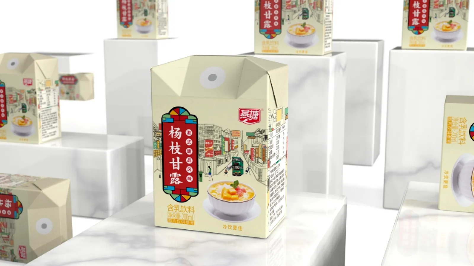
Mango pomelo sago is a Hong Kong dessert; as a milk-based drink it must say two things at once — dessert flavor, and milk beverage. The Yantang Mango Pomelo packaging design does it with four moves: a vertical red-and-blue label that anchors the product name, a Hong Kong street illustration carrying flavor and origin, a fixed bottom band with product shot and category line, and a side panel ordered by regulation with a clear coding area.
Extending the same layout to other SKUs only swaps the flavor band and hero image. See the packaging design service page for the full brief-to-prepress process.
6. Three common mistakes
- Treating dairy like a snack: busier graphics blur category cues and make the pack harder to find.
- Locking illustrations before information zones: the hero image eats the coding area and the whole layout is redone.
- No template for the range: every new SKU is a new design — costly and incoherent on shelf.
Planning a dairy launch or a packaging refresh? We start by mapping structure, information zones and labeling constraints, then design.
Packaging design · Start a project · +86 400-6619-020