
Pharma and health packaging differs from FMCG because three rule-sets apply at once: regulation sets hard limits, channels require readable information, and consumers need to trust the product. When they conflict, the order is regulation, readability, then aesthetics—never reversed. Here is that order translated into design actions.
1. Three constraints: regulation, channel, trust
- Regulation: prescription medicines, OTC products, health foods and medical devices each have their own mandatory statements and placements—type sizes, warnings and approval numbers are fixed.
- Channel: a pharmacy is a half-metre, staff-recommended environment; hospital channels reward professional restraint; e-commerce needs to be clicked at thumbnail size.
- Trust: medicine is a low-tolerance category. The pack must read as a legitimate product, not as an advertisement.
2. The compliance checklist
- OTC marks placed, sized and coloured to specification—never crowded or weakened by design elements
- Approval number, manufacturer, specification and storage conditions complete and legible, not lost to finishing effects
- Health-food logos and mandatory warnings not reduced below legibility
- Claims limited to the approved scope; no unapproved efficacy statements on pack
- Clear space reserved for traceability codes and batch numbers so inkjet coding never strikes type
Run this review before artwork sign-off. Changing structure costs far more than changing copy, and one reprinted batch pays for the whole check.
3. Four moves that build trust
- Restrained colour: brand colour plus neutrals; avoid large saturated clashes. Pharma colour language is sober—bright colours work better as category coding than as the main visual.
- Readable type: body copy keeps its size and leading; display type may have character, but ingredients and dosage must never be stylised.
- Information hierarchy: brand—category—specification—efficacy area—warning area, in a fixed order so scanning never misses critical information.
- Finishing that supports quality: matte lamination, spot UV and foil reinforce authenticity, but cost and capacity must be checked—and gift packs should not share a finishing spec with mass-market packs.
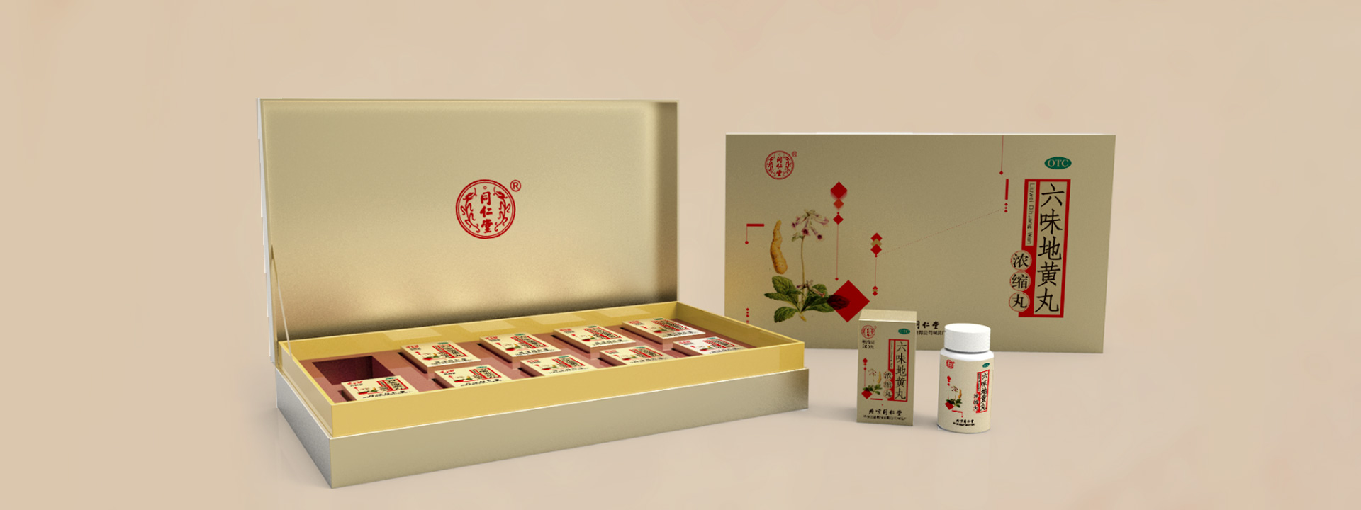
Take Tongrentang Liuwei Dihuang Wan: gift box, bottle and carton share one visual grammar—seal-style mark, stable information zones, restrained gold accents. It carries the heritage brand's trust equity while staying recognisable in new channels. One grammar, many formats.
4. Two contexts, two priorities
Pharmacy shelf: the main visual must read within 1.5 metres, the category colour block must separate from a row of similar packs, and specification and dosage form must be legible at a glance. With limited facing, what you put on the front matters more than back-panel copy.
E-commerce and private channels: prioritise thumbnail recognition; the detail page carries efficacy explanation and credentials; shoot front, side and back—not just one hero angle.
5. Common pitfalls
- Applying FMCG visual intensity to medicine, diluting professionalism and lowering trust
- Compressing warning and instruction areas for aesthetics, then being rejected by the channel and reprinted
- A refined gift pack with a separate visual system for the mass-market pack, so the shelf cannot tell they are one brand
- Designing graphics but not structure, so the carton and insert fail in transit
Conclusion
Good pharma packaging makes compliance part of the layout order rather than a patch applied afterwards. Trust then follows naturally—it is not built by adding gold and foil.
Our packaging design work covers pharma, health foods and wellness categories, from structure and layout to print finishing. If a launch is coming, let's talk about packaging and compliance scheduling: +86-400-6619-020.